NEW BRAND IDENTITY
With northern Italian roots and a global presence in New York and Amsterdam, Alto knows what it means to work from a higher vantage point: to see farther, move faster and turn what’s in front of us into something unmistakably great. The new visual identity captures that feeling of ascent and makes the impact we create with clients visible across the system.
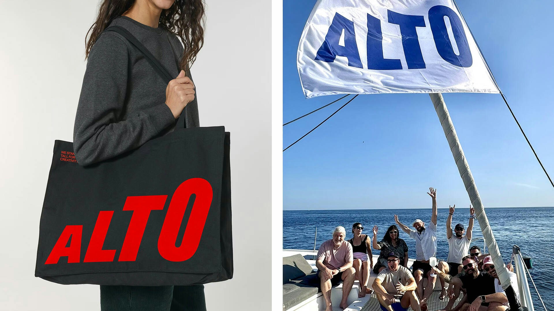
We start at the top with the logotype, set in a fast, slanted cut of ABC Dinamo’s Gravity—a playful yet impactful typeface inspired by heavy grotesque faces from the ’60s and ’70s. The four letters of A L T O grow progressively taller across the wordmark, symbolizing growth and pace. The gesture is distinctly Italian and nods to wordmarks like Ducati, Pirelli and Lavazza, hinting at speed and relentless energy. The same intentional sense of growth appears in graphs that highlight client impact, as well as across the website, where playful grids and hover effects carry that energy.
Headlines stack into mountain-like formations, signaling that every initiative is grounded in a strong base and foundation—where Alto always stands tall for creativity, craft and innovation.


Inspired by the breadth of brands we serve, our global team and a different mindset, Alto’s color approach is vibrant, prominent and present. Alto is here to make a positive impact on culture, driving real results and taking brands to new heights.


Client
ALTONews from alto


